Custom styling for your CFP Widget (Blog 1 of 2)

You’re already collecting Customer Feedback with the CFP Widget, but do you know how to go beyond the basic styling available to truly customize it to your branding? In this tutorial I am going to show you how to quickly and easily create a custom background and/or icon with CSS.
For this tutorial, all you’ll need is…
- Your widget embed code
- Access to your codebase
- A text editor (I use Sublime Text)
- A basic understanding of CSS
- A good cup of coffee!
Install your widget
If you haven’t already installed your widget, you’ll need to do that first, don’t worry all you have to do is find and add your widget embed code. Having trouble? Follow this guide.
The default widget should look like this on your site with no customization:

Don’t worry If you’re not an admin in ProdPad, simply ask your admin to give you the code!
Basic UI customization of your widget (in ProdPad)
If you’re an admin and just want to make some quick changes, you can customize basic text and colors of your widget (plus other options) via the widget styling tab in ProdPad.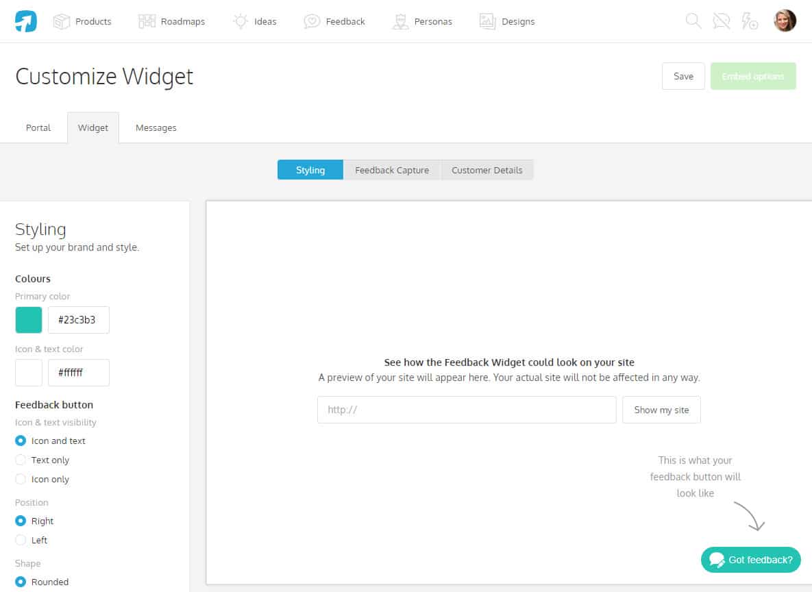
The CFP Widget customization view in ProdPad
Advanced customization of your widget (with CSS wizardry)
So assuming you have installed your widget and set some basic UI customization options from ProdPad we can look at customizing the button a little further…
Inspect the button element (right click on the widget button and select inspect) this is the HTML we see:
<button id="pp-cfpiaw-trigger" class="pp-cfpiaw-trigger--icon pp-cfpiaw-trigger--rounded pp-cfpiaw-trigger--right" role="button">Got feedback?</span></button>Let’s break this down:
- The widget button has an id ofc#pp-cfpiaw-trigger we’ll be using this later.
- The classes
.pp-cfpiaw-trigger--roundedand.pp-cfpiaw-trigger--rightare styling modifier classes that set the shape and position of the button retrospectively. (You can also configure these options in ProdPad if you want a different shape or position). We don’t need to do anything with these. 😀 - The
.pp-cfpiaw-trigger__iconis our icon class. We use an SVG as our default icon. Because an SVG is actually just code, it’s accessible via CSS, the pros to using an SVG are 1. it looks much better on high-res screens because its scalable (compared to lower res images) and 2. It has a small file size! We’ll come back to this class later. - The
.pp-cfpiaw-trigger__textis the “Got Feedback” text. This shows in the HTML but is visually hidden by the ProdPad configurations we set earlier.
With this knowledge comes power, you can now do any of the following:
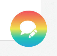
1. Add a background gradient
If you want more than just a solid background color (which you can change in ProdPad), you could do something in CSS like add a gradient! I find this generator super helpful when creating gradients as it provides browser fallbacks, prefixes and SASS versions ❤
Open up that text editor! For all CSS changes, we want to prefix your rules with the #pp-cfpiaw-trigger ID selector to make sure your CSS takes precedence over ours and avoid specificity wars.
You can add a custom gradient as follows:
#pp-cfpiaw-trigger {
    background: rgb(240,80,92); /* Old browsers */
    background: -moz-linear-gradient(top, rgba(240,80,92,1) 0%, rgba(240,148,78,1) 25%, rgba(240,228,78,1) 50%, rgba(35,195,179,1) 75%, rgba(37,167,217,1) 100%); /* FF3.6-15 */
    background: -webkit-linear-gradient(top, rgba(240,80,92,1) 0%,rgba(240,148,78,1) 25%,rgba(240,228,78,1) 50%,rgba(35,195,179,1) 75%,rgba(37,167,217,1) 100%); /* Chrome10-25,Safari5.1-6 */
    background: linear-gradient(to bottom, rgba(240,80,92,1) 0%,rgba(240,148,78,1) 25%,rgba(240,228,78,1) 50%,rgba(35,195,179,1) 75%,rgba(37,167,217,1) 100%); /* W3C, IE10+, FF16+, Chrome26+, Opera12+, Safari7+ */
    filter: progid:DXImageTransform.Microsoft.gradient( startColorstr='#f0505c', endColorstr='#25a7d9',GradientType=0 ); /* IE6-9 */
}
This amazing rainbow gradient would give us something like:
2. Change the button hover style
By default when you hover over the widget button, the background subtly fades to a darker tint of your chosen primary color. This has been achieved with CSS transitions and a box-shadow on the hover pseudo class.
Now, you might want a specific background color rather than a tint, so we can change it by setting a color and removing the box-shadow like so:
#pp-cfpiaw-trigger:hover {
    box-shadow: none;
    background-color:#E95EAC; /* ProdPad Pink */
}
This would give us the following:

You can also experiment with the transform property on the widget to do things like making your widget grow on hover, for example:
#pp-cfpiaw-trigger {
    transition: color .15s linear,box-shadow .15s ease-in-out, background-color .15s ease-in-out, transform .15s ease-in-out!important; /* Change the existing transition property to include the transform value */
}
#pp-cfpiaw-trigger:hover {
    box-shadow: none; /*Remove the existing shadow*/
    background-color: #E95EAC; /*ProdPad Pink*/
    -webkit-transform: scale(1.1); /* Ch <36, Saf 5.1+, iOS < 9.2, An =<4.4.4 */
    -ms-transform: scale(1.1); /* IE 9 */
    transform: scale(1.1); /* This will scale our button up so it looks like it’s growing! */
}
This would give us the following:

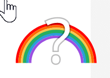
Add a custom icon image
If you want to use your own icon instead of ours first of all we need to hide that SVG we talked about earlier.
Hide the existing SVG with the following code:
#pp-cfpiaw-trigger .pp-cfpiaw-trigger__icon {
    display:none;
}
As the HTML is generated by our script, we’ll need a different way to add a new icon.
We can use the ::after pseudo selector which allows you to add new content (e.g. our icon) on a page without needing to edit the HTML
#pp-cfpiaw-trigger {
 padding:4px!important; /*Reset padding to what you want*/
}
#pp-cfpiaw-trigger::after {
content:"";
display:block;
background:url(question.svg) no-repeat center; /*Path to your custom image*/
height:40px;
width:40px;
}This should now look like what we have in ProdPad:

Note: I’ve used an SVG which you can download here but you can use a transparent PNG or GIF to achieve the same result. Older versions of IE don’t support SVG so check your browser support first!
If you have a completely custom button image you want to use instead, you don’t need to use the ::after selector you can just replace the background property on the button like this:
#pp-cfpiaw-trigger {
    background:transparent url(../img/icons/question.svg) no-repeat center!important;
    border-radius:0!important;
    padding:0!important;
    width: 70px; /*width of your background image */
}
#pp-cfpiaw-trigger:hover {
    box-shadow:none!important; /*Remove the hover shadow*/
}
And last but not least:
Note: If you’re finding that your colour is being overwritten by the default settings, make sure your CSS is being loaded after our widget CSS. When multiple declarations have equal specificity, the last declaration found in the CSS is applied to the element. You might have to use the !important class.
There you have it, if you have any questions drop us an email, or tweet! My next blog will talk you through adding a pop up menu like we have in ProdPad 🙂
One thought on "Custom styling for your CFP Widget (Blog 1 of 2)"
Comments are closed.
@danielle Great article, but where is 2 of 2? I was hoping to see content on how to trigger feedback without using the Widget.