Now You See Me! Feedback to Quick Win in Less Than a Day

Everyone knows how traffic lights work. Red means stop, green means go. But we forget that even if every color in the traffic light were suddenly, say, purple, the one at the top would still mean stop and the one at the bottom would still mean go.
Without additional context, colors lose meaning.
This is how one of our users, Daniel Stanton, explained it to me in a conversation in the Mind the Product Slack community the other day.
He was talking about the new color scheme we had introduced to our idea voting system. We’d recently done a small overhaul to make it more fun and easy to use, complete with a thumbs up, down and out icon set paired with a red, green and yellow color scheme.
For clarity, we added simple tooltips on hover to indicate that these meant Like, Dislike and Unsure.
But Daniel had a different point to make: What about the color-blind users?
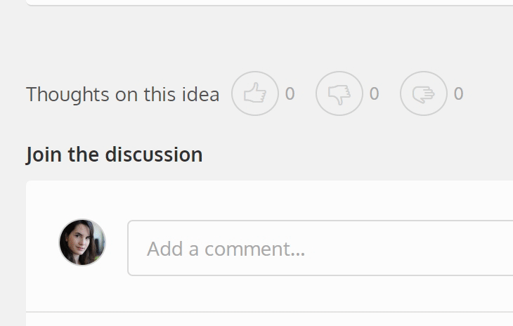
You see, when someone adds their vote and a comment to an idea, 92% of our audience sees this:

The remaining 8% who are color-blind see something different.
Now, there are a bunch of different types of color-blindness. I ran an example of our current design through a color-blindness simulator.
Here’s what the same positive vote looks like if you’ve got a deuteranomaly form of color-blindness, the most common type that involves a red-green color deficit.

Not so clear it’s a positive vote anymore!
It’s funny that Daniel pointed this out and that we hadn’t thought of it when first designing this voting system. When running demos of ProdPad, I always use color-blindness as an example of a problem to solve!
But here we were, dropping the ball. So we looked at ways to improve the experience, even though we knew we didn’t have a lot of time to put towards it.
I worked with our UX Designer, Kav, and we went through a few potentially quick solutions.
How do we fix this without a lot of time?
Potential Fix #1: What if we added a hover state with context?
This one put too much onus on the user. We didn’t think people would think to hover over a user’s avatar in a discussion thread to see what a color means. Solution thrown out.
Potential Fix #2: What if we changed the luminosity to have a contrast ratio of 4.5:1?
This one would drastically change our colour palette, and there was no easy way to detect and dynamically adjust luminosity on the fly. It certainly wasn’t the simplest way to solve the problem, and Danielle, our UX Developer, had experience in trying this before that was helpful in steering us away from this time sink. Solution thrown out.
Potential Fix #3: What if we added some context inline, next to the user’s name?
It would provide quick visibility and understanding of the action the user just took, and was simple to execute. Solution accepted!

We created a new idea in ProdPad, wrote up our notes and included some mockups. On our Priority Chart, it fell squarely in our Quick Wins category.

I pushed it along to Trello to be picked up by our development team.

And there we have it, from feedback to quick win solution in a matter of hours. Thanks, Daniel! You just helped make ProdPad that much more awesome.